Home › Brand
Brand
Brand strategy and design. From the name to the market.
We help businesses define their brand and put it to work. We develop positioning and names, design identities and packaging, and carry them into campaigns, online stores and trade programmes.
The practice
What we deliver.
Strategy
Brand strategy · Brand architecture · Nomenclature design · Verbal identity. Where the brand sits, how its ranges fit together, what each one is called and how the brand speaks.
Identity
Identity design · Visual design system · Colour system · Typography system · Brand guidelines. The wordmark and symbol, and the rules that keep them consistent wherever they appear.
Application
Packaging design · Catalogues and retail material · E-commerce design and build. The identity carried onto the pack, into the catalogue and into an online store we design and build.
Go to market
Creative direction · Campaign · Brand film · Trade programmes. The campaign and film that put the brand into the world, and the distributor programmes that carry it to the counter.
Selected branding work
A different brief for every brand.
Essdee needed a structure for its growing range. 92 needed a brand and a route to market from the start. Hamic and Nilva show how an identity carries into everyday products and their packaging.
Selected branding work · Apparel · Case 01
Essdee. From factory brand to house of brands.
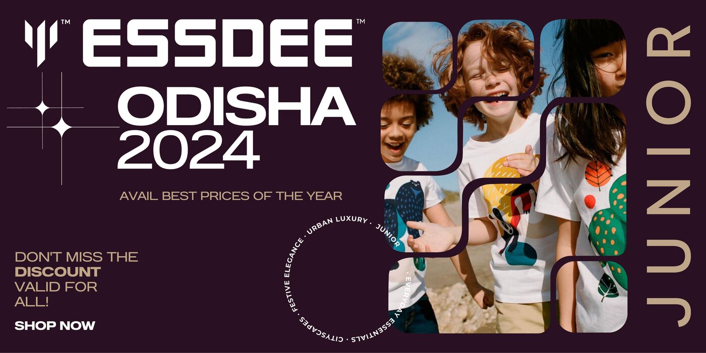
Essdee had built trust under one name. As its range grew, it needed a structure for new categories that would keep that trust. We rebuilt the identity around a new wordmark and mark, with a category and naming framework that extends from Essentials to Junior.
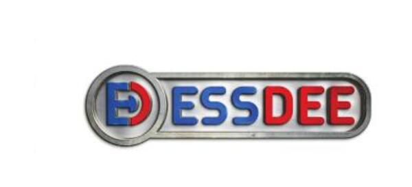 Before
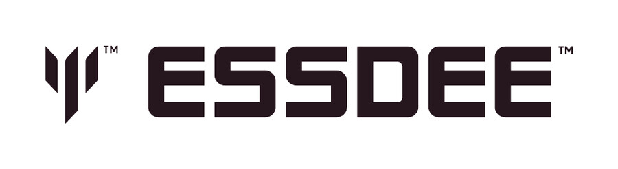 After
AfterA structure for the growing range.
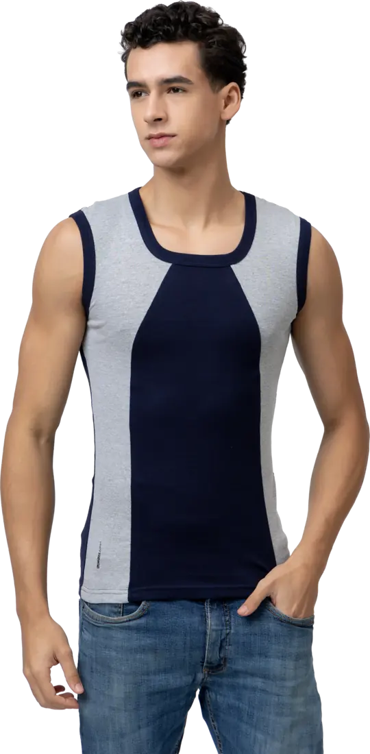
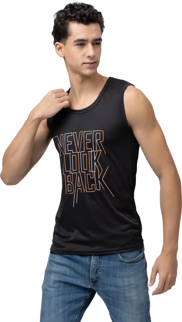
Unprofitable SKUs were audited and cut. Kidswear and Designer Vests launched under the new structure and are now among the house’s strongest sellers.
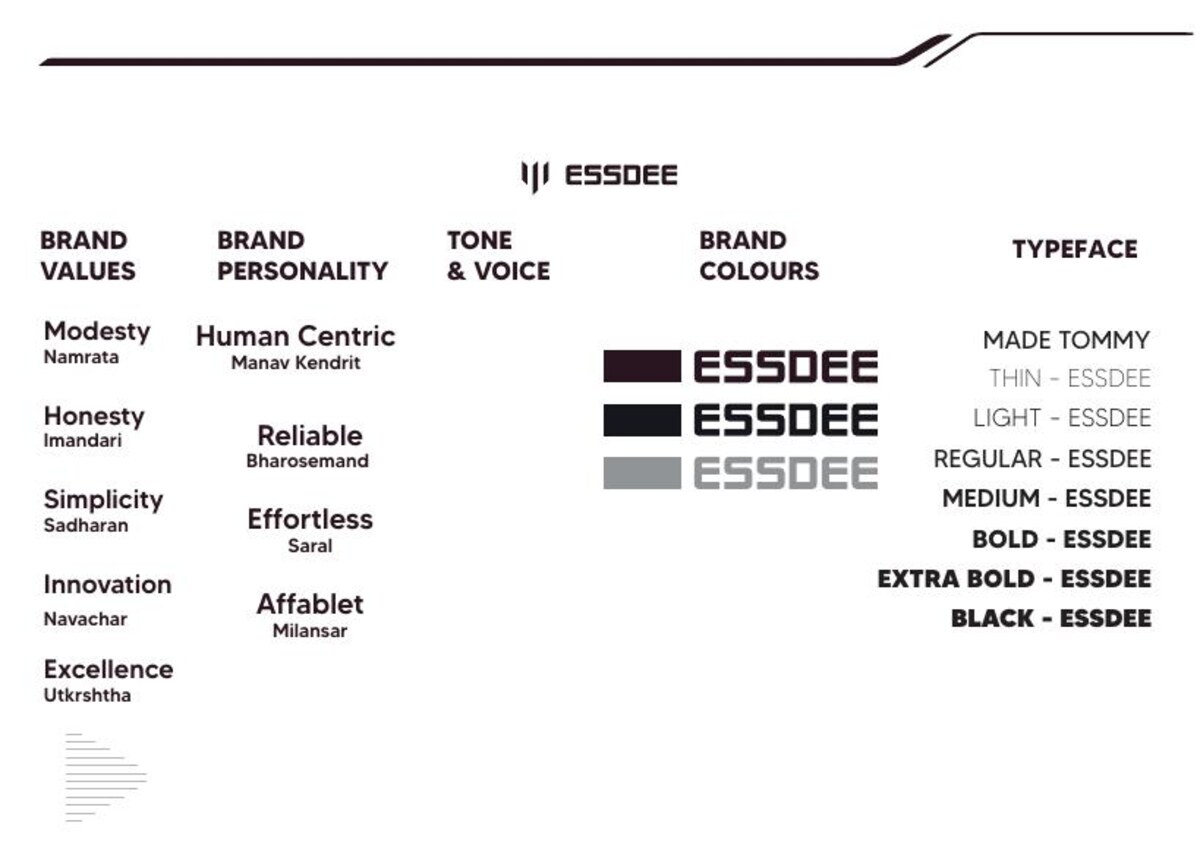
The identity in use.
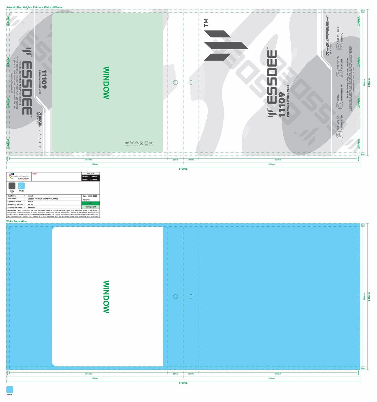
The brand system defines values and personality alongside tone, colour and type. We carried it into the catalogue and packaging so the range shares one identity.
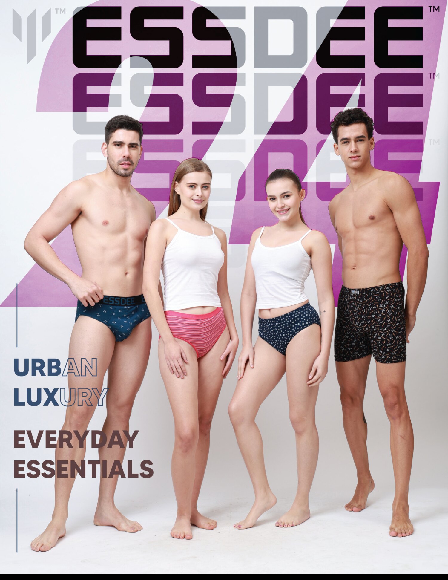
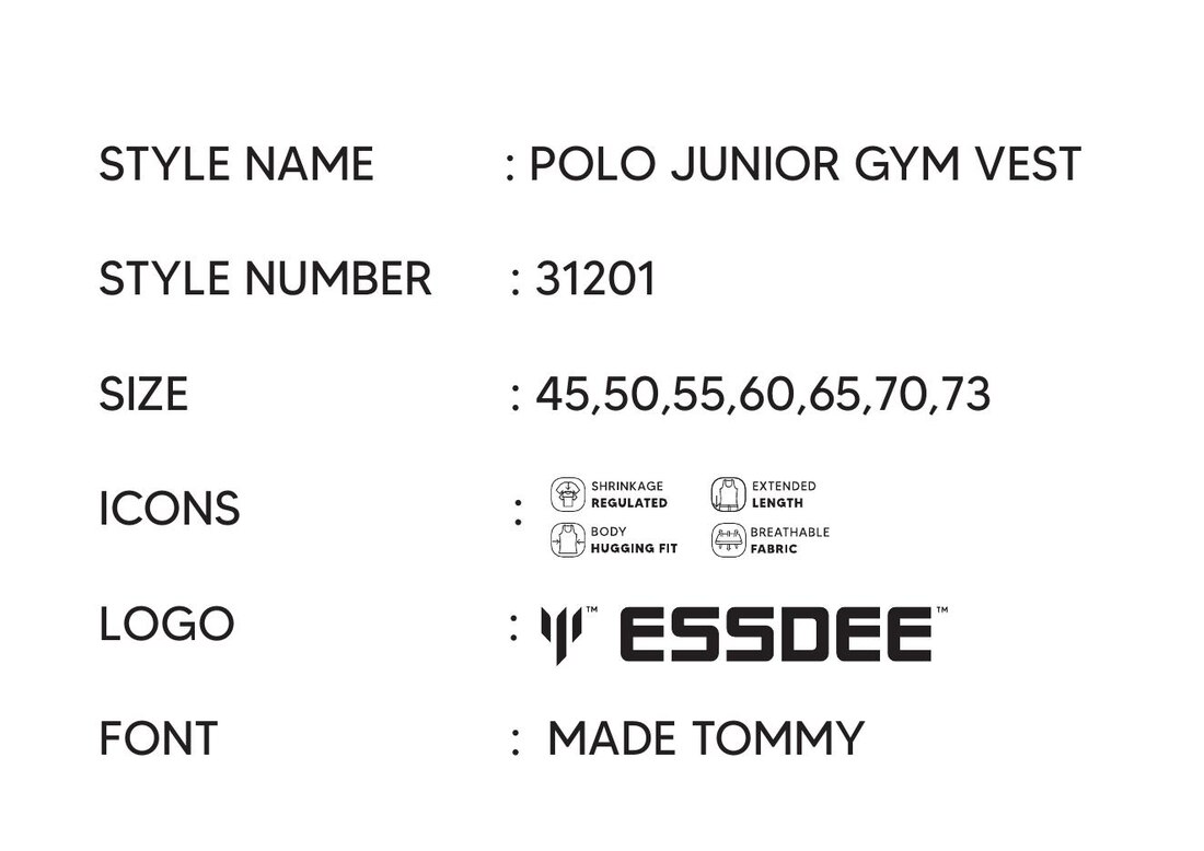
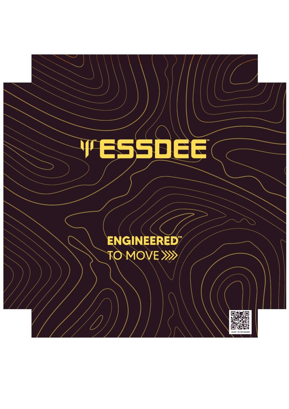
Connected to the product.
The work also includes tech packs for every style and a pattern-and-marker CAD library. These support the apparel range behind the identity.


Carried into trade.
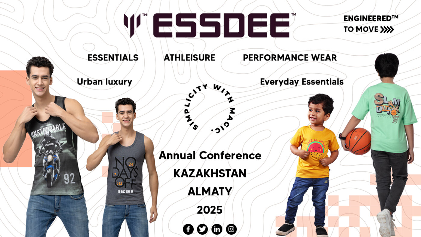
The trade programme extends from regional activations to the distributor conference. The house now reaches 10,000+ retail counters, recorded in the distributor portal, across 20 states & UTs.
Selected branding work · Performance · Case 02
92 — a performance brand built from the start.
92 set out to build a performance-activewear brand from scratch. It was co-founded by the people who lead this practice. Our work covered its identity, a compression product system, a campaign, its own e-commerce build and distributor agreements.
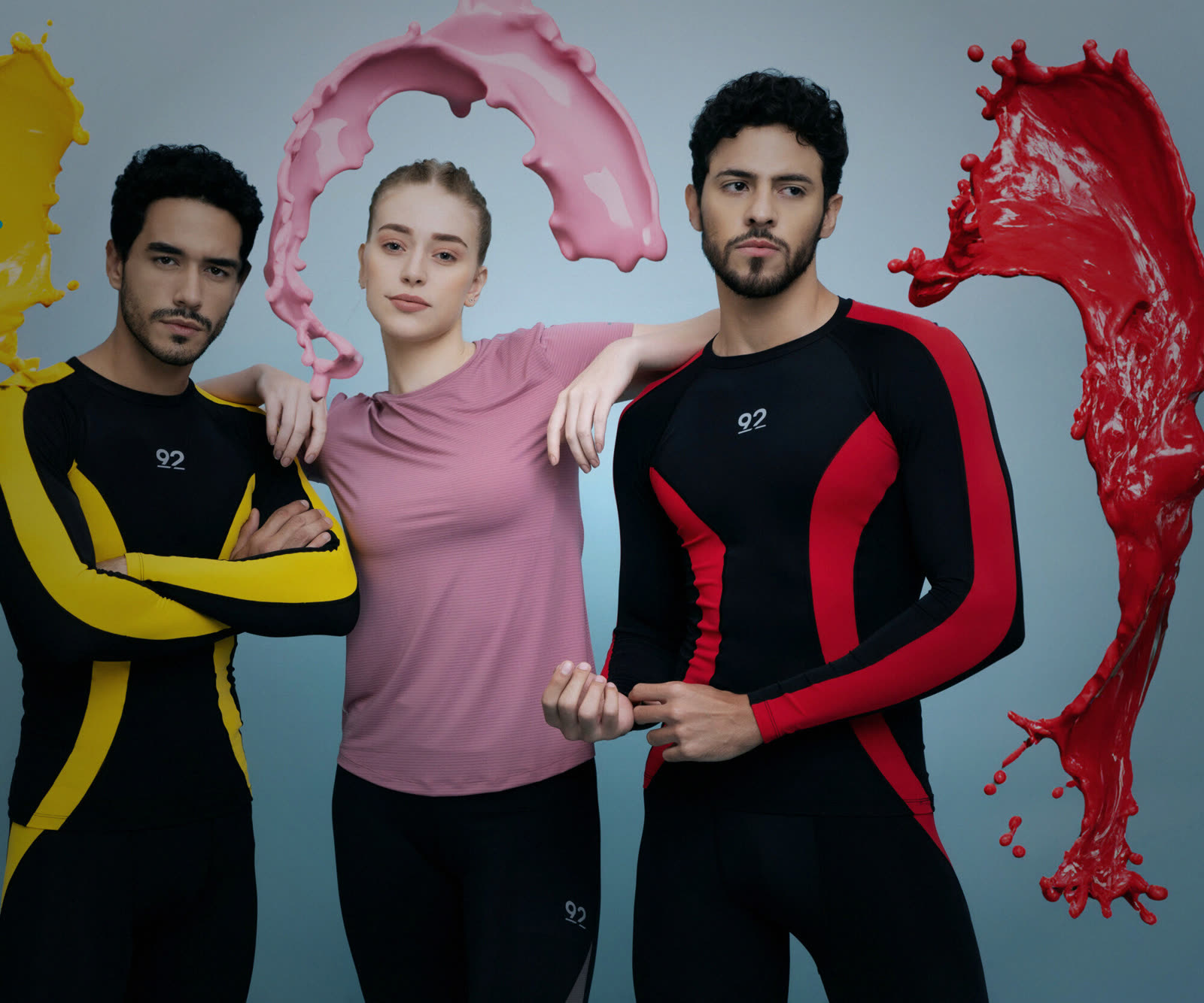
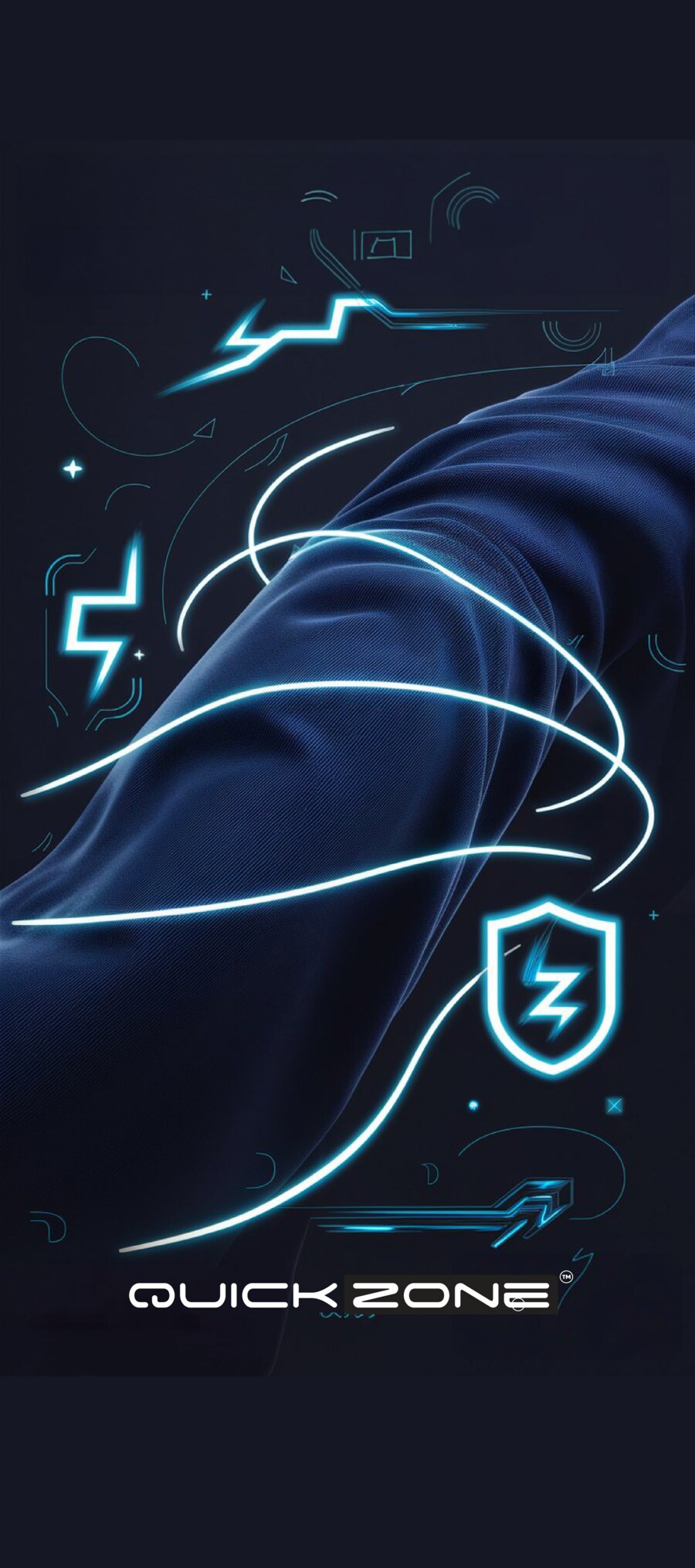
An identity shaped around performance.
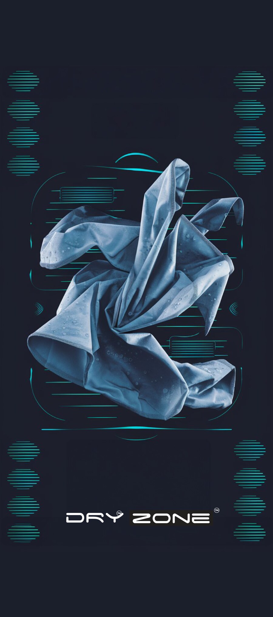
The visual language uses a dark ground and electric neon. The campaign carries it into product stories that explain the fabric technology.

A route to market.
We designed and built the storefront, including its structure and shopping experience. Distributor agreements were signed as part of the launch.
Selected branding work · Family innerwear · Case 03
Hamic. An identity built around everyday comfort.
Hamic takes its name from amicus, Latin for friend. We built the identity and packaging around an embrace, giving a family innerwear brand a clear idea to carry across its range.
A name and a promise.
The brand centres on everyday comfort for families, from kidswear to men’s and women’s innerwear.
Feel Close. Stay Comfortable. Togetherness · Trust · Softness · Simplicity · Quality.
The idea made visible.
Two figures form an “H”, joined by a soft curve. The rounded wordmark and warm humanist type carry that idea into the identity. Navy, clay, sand and off-white form the palette.

Applied to the pack.
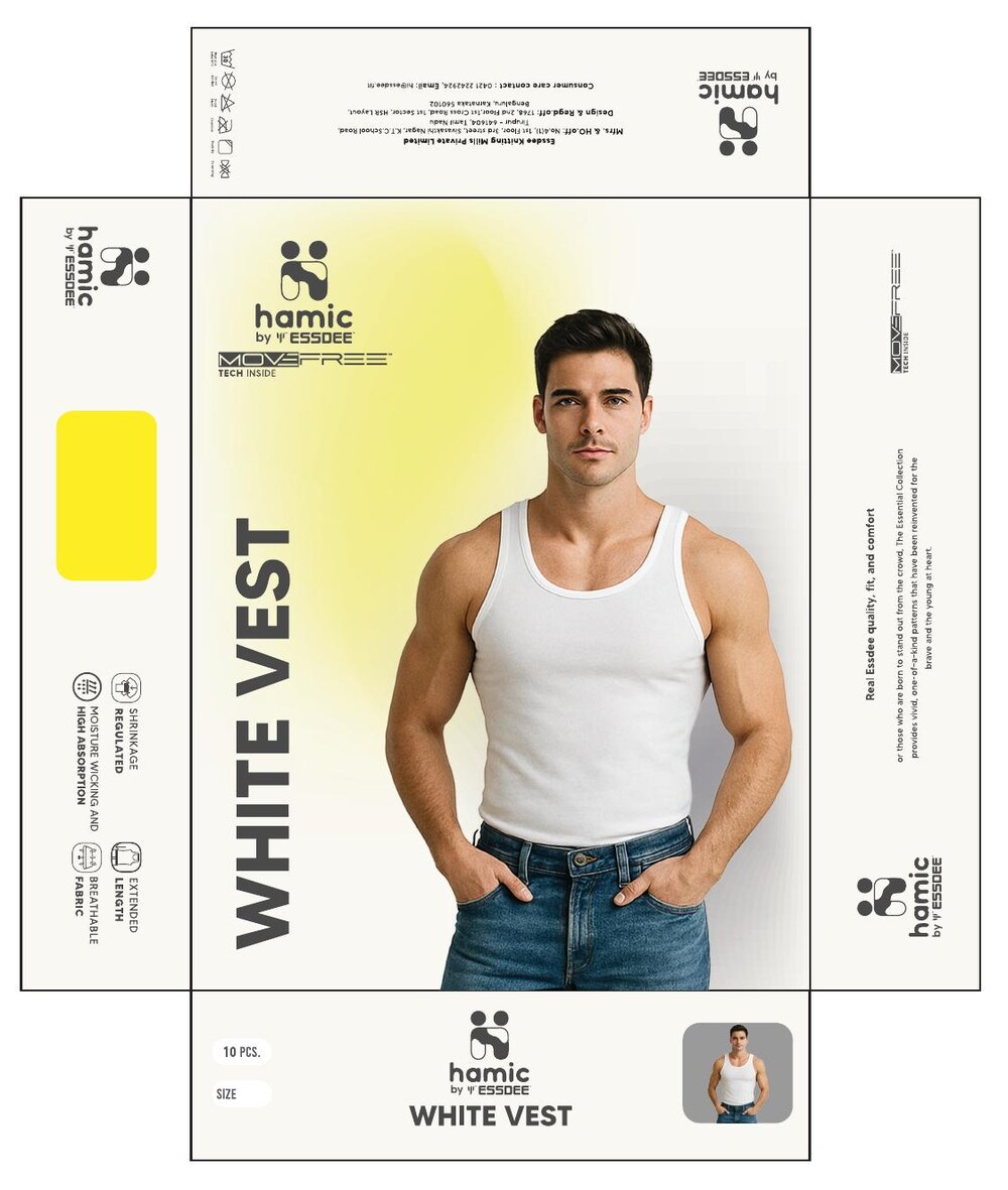
The retail packaging brings the mark and colour system together on the white-vest box.
Selected branding work · FMCG / Dairy · Case 04
Nilva. One identity across the dairy range.
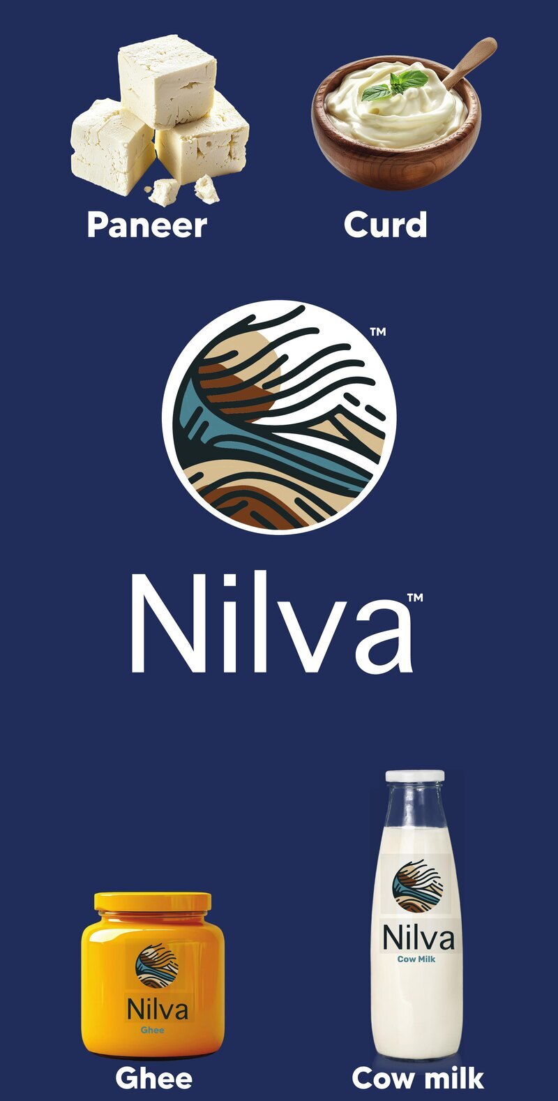
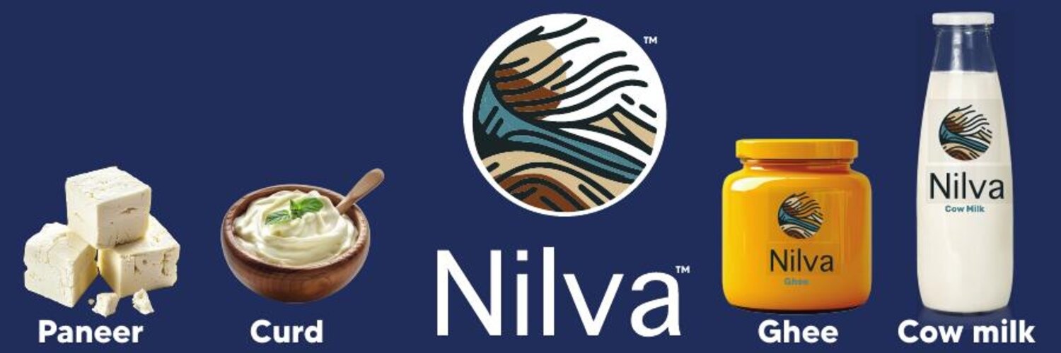
Nilva is a premium A2 dairy brand. A sunrise over fields anchors its identity, with packaging that carries the mark across milk, paneer, curd and ghee.
The brand’s line: Nature, in its purest form.
A mark drawn from the land.
The identity uses navy, gold, wheat and cream. Its voice centres on nourishment.

A consistent product family.
The packaging adapts the identity to the milk bottle, ghee jar and the rest of the range. Each product carries the same sunrise mark.